It's a free newspaper and any one can pick it up, it's very popular paper and more people will see the add. It's a general paper, not too political like most, and not tabloid like the sun. It's distributed all over england, and main areas of Scotland and Wales.
-Example from the Metro (on my TA/Topic):
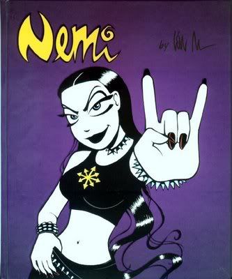
(Nemi is a cartoon strip in the metro that as i have recently found out, many comic readers enjoy, and is also sold as an actual comic book, this relates well to our TA.)
(This is a picture of the Metro newspaper promoting the newly released Watchmen movie, based on an award winning comic by Alan Moore.)
-There are also the different shapes and sizes that you can print them in which allows more room for creativity:
My group are looking for something in 'populer sizes in listings' like the 20cm X 3 columns one is what we're aiming for. (Zane however wants a full page add).
Here are all my ancillay's together in one presentation on Slideshare, since Google just wont work for me any more. There is still so much to do though, a media students work is never done.
(Please click on the Menu option on this and click fullscreen to see the writing!)
Which Magazine to publish the double page spread in?
I have chosen either: (Click on these to go to the websites)
Or,
...to have a range of options.
-My main option however is SFX.
Why?
Because 'Closer' magazine has too much of a clear focuse on celebrities/soaps/gossip, and isn't for our TA from looking at the TA description on the Bauer media website.
'Entertainment Weekly' is an american based magazine, and i'm not too sure if we can include these, so i'm not going with that just to be safe. However it would have been the best option.
'Panini Comics', i believe, from what i have seen on their website, only prints comics, not actual magazines, 'we also have about 25 regular comic and magazine titles '.
'SFX' is a British sci-sfi magazine that has a lot of comic related articles and seems like a relevant place to put out double page spread. From the material inside it is the perfect attraction for our TA.
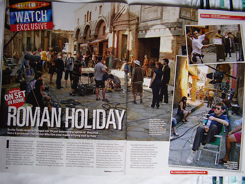
-Example of Double Page Spreads From 'SFX' (relating to my TA/Topic):
This top one i thought was quite odd to have in there, but it's good because it tells me that the magazine has a good variety and that my double page spread could possibly fit in well.
And also, just to show you:
(Women in Video Games: are there enough female videogame characters?)
-Features i like:
I like the colour scheme here, and the simplicity of the layout, especially the personalised title.
Here i like the personalised little red rings the pictures are in.
-I am considering using these conventions in my next draft of the double page spread.
-For this, I've stuck with the idea of having a woman at the center of the add. and used Zane's idea of the comics, and also added his text and text style to the add. I've also changed the colour to orange to match the logo.
-This time I've kept the woman clear, and obscured the background a little with her hair. I've kept the comicy box style for the lettering (art by Dustin Nugyen).
-I've gone with zane's idea of having comic books in the picture, and also used his box style for the lettering, which is quite comicy, and used an orange colour scheme to match the logo, with a white border, which, in hindsight, doesn't work very well.
-I've used the picture of a woman in the center, which was always the original idea, but I've blurred her out in the front to give the idea of woman obscured in comics. I was worried that if i blurred the comics in the back people might not be able to tell what they were.
-I've used a different font compared to the logo to give variety.
EBI: It's too busy, and should be a little simplified, the woman in the front shouldn't be blurred.
So, for our double page spread and news paper advertisement, i've gone off and done some research, and i've found some handy sites that i can learn from. Here are are few examples of double page spreads. (This post is a continuation from this one.)
--So from looking at this presentation, it seems that for a double page spread there are limited colour schemes, quite simple, fashionable and effective. The layouts are very open, they're not clustered like, the front page of a magazine lets say, and it makes it easier to read and nicer to look at. The pictures get to the point, they have to be large to call out to the reader.
(note to self: good website to upload my first individual presentation onto and post to blogger.)
-Here we can see that the graphics, just like the first slide i sound above, match the mood of the pictures.
-What i especially like are the blown up quotes, thats a good quick insight into what the article actually talks about. The pictures are the primary source for getting the readers attention, then the title/subtitles, then the bold quotes, much like the pyramid style of writing journalists use to get readers to keep reading.
It was quite a journey to get it to where it is. We've taken heed of the mark scheme, so i hope it works out. I am happy to present 'Women in Comics & Comics culture'
Now, down to our ancillary tasks ^_^
Just a note- I don't believe that we should have had to make our own music for our documentary, documentaries don't really do that. (I caught something on Tv a while ago that had the same part of the Foo Fighters song that we wanted to use in our documentary, and it really does work well.)
At first we wanted a slide show with covers of comic books with women on them. But then we went with Zanes idea instead, which is the new beginning of the slide show. He put up of the clip of batgirl, anime con., the comic flip and then the interview, this worked much better visually, then me and Mirella edited it.
Our first idea for the Comic Corp ident was to have someone flipping through a comic book, reaching the logo at the end, then to cross-fade that into the actual logo, (bellow, rought visual) -but instead we came up with the three women passing it around instead. The previous idea proved to be difficult in terms of framing and pace. This one was better because it incorporated the idea of women.
-Right, i was planning on putting up the storyboards, but that will take long, my computer is quite slow (scanning, uploading etc.) So i give you this.
We had to structure how it was going to start and finish, so we did a mini plan. At first it looked like this:
Which is an unreadable mess made by me and zane.
After, i think, about three attempts, me, Mirella and Zane came up with this:
Ok, so i haven't been able to hope onto a computer and just post this, but here is the news:
FILMING AT FORBIDDEN PLANET:
-It went ok, we filmed what i said we were going to in the last post, but we were unable to film inside, so we took some pictures that we might be able to use. (It wasn't explained to me in the e-mail from Mr Harrison that there were other issues to do with getting permission for filming there.)
TEACHERS COMMENTS:
-Problem! The opening shots of our production were good, but the sound quality was awful, so we have had to scrap the whole thing, and do it somewhere quieter, it would be great to do it outside, but both Calamity and Forbidden Planet are on main roads, and this just wont be possible.
-Solution! We will be using our schools drama room (with good lighting/acoustics) to do the presenters introduction, with comic related material displayed, this will work very well. Mirella is organising this with the drama teacher.
-Problem! We show much too much on our opening, it's supposed to be a taster, but we explain too much, and we will not be able to fit everything on the script into our extract.
-Solution! We've edited the script, cut it down, and organised it better. So the plan is, it's only one scene, the presenter talking then the voice overs coming in with relevant clips, rather than what we originally hoped (which was the presenter appearing in front of the places we were going to have on the documentary, as well as the voice overs).
(Note: We already have all our clips, so what we could do is rearrange our storyboards maybe, just to keep everything the same, but come editing i dont think there would be much point to it.)
MUSIC:
-Me and zane have been discussing it, and we have come up with come music we would like to use in our product. Here is the e-mail, with a list of music we have compiled. He wanted to find music that we relevant to the topic,
' i trying to link music to purpose and the purpose of the documentary was to show that inequalitity to women in comics is problem maybe?'- Zane
- will be awkward with the voice overs, and is too negative.
3.I'd come for you- Nikelback
-it's too sad.
WILL BE USING 4. Kryptonite- Three doors down
- Opening music. (already did the permission thingy with this one.)
5. when you were young- the killers
-good second option for opening or other part, relevant lyrics, good tune.
6. Foo Fighters - Times Like These
-After opening. Listen to it from 7 seconds too 15 seconds, i am thinking we can repeat this part for as long as we need to.
SOME TO CONSIDER 7. Let it rock- Kevin Rudolf (http://www.youtube.com/watch?v=dh3gGQfyVyw )- good but but i think it will be an awkward mix, but we'll see, i want to try this one, we'll ask mirella and mohammed what they think.
Well, miss said that what we have is good, but the order we have them in doesn't work visually,
--E.g. we have a few shots of someone drawing, so naturally it is assumed that next a person will be talking about drawing etc, but then the next few clips after that show something completely different.
My argument for this was that it would all be explained in the voice overs, but I've taken her judgment into account, so me and my group will be doing some re-organising of shots.
NOTE: Our group's idea's really do mesh well together upon viewing the clips. Zane's consumerism idea, (I'm thinking of the the shots of stalls with more masculine comics, followed right after by more feminine stalls, i like the contrast there.) and Mirella's on showing comic culture, so far it's mostly men on the comics side, and generally girls and boys one the manga side, but girls are associated with it a lot more. Unfortunately, Mohammed's is the odd one out here.
--It went very well, we got *everything* we needed, however, Mirella pointed out to me that while the interviewee was talking there was music playing in the back ground, which none of us really noticed, but this shouldn't pose a problem. Most of the interview will be cut and muted, and we might then have to go back for some re-filming, or maybe to just get some sound recordings of him talking to use as a VO.
This is Eric (interviewee) Zane has some more pictures of our trip HERE, on his blog.
On another note...
--We have started uploading and editing, and so far it's looking good, but we need to do a lot more editing, and i will also have to record my VO's straight onto the Mac computer.
(My opinion on Macs' can be wholly summarised in one word; unreliable.)
2) 'Make sure that the audience know that there will be more to the documentary (5 min extract, therefor an idea of what they are going to miss out).'
- Well, the rest of my group are thinking of idea's for this point. Here is mine:
Do a random fade out during mid-sentence, while the presenter is talking: This should (hopefully) create some frustration in the audience, so they would want to know about the rest of the documentary.
(I will put up the script later on, i seem to be having trouble with putting it on google docs from my home computer, same for my original power point presentation.)
Well, i hate how it's getting dark so early, so we're going to have to do what we can. So yes, filming on Tuesday (the interview) and then on Saturday (the rest of what we need from Calamity, so it will be lighter still). Loving Zane's improvement on our opening slide show, that will look great! My extra research/analysis for the ancillaries will be up later, and tomorrow hopefully we'll see how miss got on with her marking of our storyboards/scripts/shot list, they all needed to directly correlate, which is quite difficult :S *fingers crossed*
Well, blogger really isn't that great for putting up so many pictures like this. It's an easy site to use, but when you put up pictures they always get placed at the top of the post, so you have to move them around. For this, i uploaded all these scans, went and copy pasted the HTML onto word and put them in the right order. The posting windows are too small to do this efficiently. (Click to view larger.)
This was my initial idea= simple, bold language in a 'comic' font, but still serious.
Some conventions i want:
-Something with more going on maybe e.g (pictures?) information (text). -More colorrful. -Feminine but not threatening to men. -Again, 'comicy' but sending out a serious message, in tone with the production. -Some examples: (basic) (better)
It has Wonder Woman on the front there, in a defensive pose, i think this is good because it represents women positively saying 'we can fight this!' or something of the sort.
-I think selecting a picture to put on there might be a little tricky. Should it show a powerful woman? Or one in a more unfavourable light? (These are just examples)
-The documentary is about Women being treatedd unfairly, and there is evidence of that, but people's opinions differ, so it's about exploring that issue. That and showing, rather than talking about comics culture too.
Upon looking at this website, about the advantages to Newspaper ad's, i don't think that the text on my add can be that explicit, lets say.
Here is what i had in mind, something with our logo, and the channel that produces our logo. More 4 does a lot of documentaries, so i thought this would be appropriate.
2) Feature article
It has to be a:
center spread
The two facing pages in the center of a magazine or newspaper.
A feature that occupies the center of a magazine or newspaper: a four-page center spread devoted to the championship playoffs.
Or just a regular double page spread, from anA-list magazine.
Some conventions i would like to have:
-Double page spread. -Ratio of pictures to words should be bigger. -A few comments from the production by interviewees in bold, a quotation. (e.g picture below 'it wasn't easy') -It should be focusing on a) what the documentary is about and b) What actually goes on/what is shown in the documentary, and lastly c) it would be nice to have a little review at the bottom, or just give the writers POV. -A big background picture, satellite pictures, logo of the company/documentary, and a subtitle.(e.g like this, with text at the bottom.) Me and Zane talked about this, and we have some idea's, he's working on a first draft of our double page spread.
I'm nervous about being on camera, but hopefully, it will all be good :) It's all planned, and we have the whole day, and Zane told me about the rain, although i checked again and found out it was only light rain, but we'll see.
Mirella, Zane, Mohammad and me had our meeting today, and we worked on a storyboard for the anime convention part, a plan of what we were going to do there, here is an extract of our meeting. (Seen: Mirella, Me/Heard: Zane, Mohammad)
(Mohammad on storyboards)
(Mirella's original storyboard idea/plan) Here is our storyboard/plan for Anime Con. (click for larger image)I believe i can safely say, none of us can draw.
1. I have contact from 'Forbidden Planet', I'll be communicating through e-mail with Mr Harrison, the Internet&Marketing manager later on after our plans for that part of the documentary are finalised. I'm going to give him details of what we want to do and he's going to help us with that. (They've even let the BBC film there.)
2. I have calamity's number, I'll need to call them and give them some dates we would like to film, they have already agreed to let us. (note to self: make little slips for them to sign)
3. It's decided that i shall be the presenter. I'm not too keen to get infront of the camera, but we have decided that i'm the best candidate. (don't click for larger image... please.)
DATES WE WANT: 4. Zane and Mohammed did the shot lists and some questions for us to ask.
To do list: -finish the rest of our storyboards. -make a post about the anciliary tasks. -find out who to contact about asking permission to use commercial music.
I think this is it for now, might come back to add more.
I'm a media student at the Convent of Jesus and Mary Language College, London, doing my A2's. This Blog is to record the progress of my media course work. Posts here are for the benefit of my teacher and of my self.

 (This is a picture of the Metro newspaper promoting the newly released Watchmen movie, based on an award winning comic by Alan Moore.)

 My group are looking for something in 'populer sizes in listings' like the 20cm X 3 columns one is what we're aiming for. (Zane however wants a full page add).

 My group are looking for something in 'populer sizes in listings' like the 20cm X 3 columns one is what we're aiming for. (Zane however wants a full page add).